Signs & Wonders
I
Sometimes if you look at something intently and look away there is an after-image left behind. It can be very intense. A profile or a fragment of pattern can feel as if it is burning on your retina. Or the after-image can be blurred, made strangely more real for the penumbra that has taken the place of what was in front of you.
The old Ceramic Galleries that stretched along the top floor on the Cromwell Road side of the Victoria and Albert Museum have gone. But there is an after-image.
When I was a boy I would walk up stairs and then more stairs: it seemed an age to get to the galleries. You had to be resourceful to navigate your way through Medieval Metalwork, or not get lost in Enamels. You reached the top and once you had got up here you found yourself in a separate world. There were sky lights so the light was diffused: there are very few places that you could see out or even sense the museum below you. These wonderful spaces seemed completely self-contained, one enfilade gallery after another after another. Who would dream of building such high rooms with such spectacular volumes for a cup or a dish or a bowl?
When King Edward opened these galleries designed by Sir Aston Webb in 1909 he referred to them with slight asperity as a ‘storehouse of masterpieces’. At the top of the stairs you could turn left or right. In each direction there were armies of vitrines storing these masterpieces. There were two main types: a brass wall cabinet of fine proportions standing off the floor on a shallow cabinet; and a magisterial mahogany one on four turned legs, seven feet high and eight feet long. You could see these cases stretching into the distance.
When they were first opened a century ago a critic Claude Phillips found himself ‘overwhelmed by the vastness, the coldness, the nakedness’ of the new halls. ‘The general impression made by the naked, austere, too uniformly-lighted buildings themselves, and by the scientific or pseudo-scientific mode of classification and arrangement adopted is that of some immense, finely-appointed modern hospital for the analysis and dissection of applied art rather than that of a temple of the higher delight...’
Most of the vitrines were firmly policed into taxonomies of kiln or modeller or region, less ‘pseudo-scientific’ than a slightly desperate attempt to control the vastness of the collection. Some of the vitrines had the work of a single potter. All the pots by Hans Coper used to be in one mahogany case, huge early textured vessels shadowing the fine late Cycladic forms. They barely fitted. There were a few cases that dealt differently with a technique, or attempted to elucidate an issue, but there was not much explanation. These were spaces for the connoisseurial study of ceramics. There were lots of small cards with dates.
These galleries were full of other people’s collections. You would see one label after another with a name – Lady Charlotte Schreiber or George Eumorfopoulos – and work out that this was a collection of collections, not an orthodox run through world ceramic history. And the nature of the ceramics collection was emphasised by the strength of character of a series of Keepers who had followed their interests rather than collected by rote or by committee.
This element of the personal meant that you had places where there were little aesthetic moments in the arrangements. A garniture of French vases. The shelves of Chinese monochrome porcelain from the eighteenth century were placed so that the yellows went into reds into aubergine into black. There is a photograph from 1911 of the Salting bequest of Oriental Ceramics and it is like a very elaborate curatorial gavotte of vases and dishes. When I first started visiting the galleries in the late 1970s many of these careful dispositions were still there.
The majority of the galleries were displayed by country or epoch. This meant that you could stand in eighteenth-century porcelain (near to the early Meissen) and see askew into the Chinese porcelains. You had to be determined to do it, to make this kind of conversation happen, but you could. If on the other hand you wanted to put together say, Henry Cole’s tea set made in 1847 in undecorated evangelical white (for the working man), and a chocolate beaker and saucer made in Meissen in the 1720s with a sprig of not very well modelled prunus on it, it was considerably more complex. You had to trek back and forth to see if the there was anything in common between these pots before deciding that the forms are a bit indeterminate in both. And 25 years later I realise that there might be a shared sense of doggedness in Henry Cole and the unknown arcanist in his workshop.
I would try and map the collections slowly. First were the pots that I knew that I should like from the photographs in Bernard Leach’s A Potter’s Book. The firmly grounded English medieval jugs with their splayed feet and green lead glazes. The Hispano-Moresque lustre bowls with their almost heraldic images of birds and animals. Rich earthenware pots made by Michael Cardew in the Cotswolds in the 1930s.
Then there were the galleries with the ceramics I had to work harder to study, the English soft-paste porcelains and nineteenth century Sèvres tea-services. It was in these galleries that I’d discover odd objects that caught me and held me: an Iraninan lustre dish from the twelfth century; Renaissance earthenware pots from Italy dripping in putti and cartouches and coats of arms from some princelings court; a 30-gallon jug covered in blue and white transfers from Staffordshire.
These walks were just a prelude to the Chinese pots. These were my destination. Not just the celadons and the fluted bowls and the bottles with their vivid gestural cuts through white slip, but the late austere porcelains from the eighteenth century with their almost clinical profiles. I spent so long with these objects that I can still see one specific bowl next to its neighbour.
And then at the end I’d walk all the way back and end up in Gallery 141, the room in the centre of the floor of galleries. It was painted a rather dense grey and was the gallery for architectural ceramics. This meant, in this vast building which is both architecture and ceramic, panels of tiles from Spain and Italy and tiled stoves from some Mitteleuropa schloss.
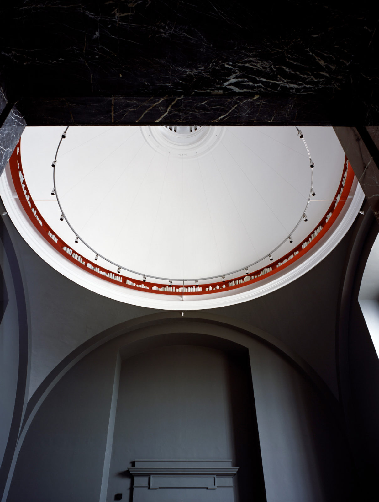
This room had a formality about it, with one huge window that took up most of a wall and three doorways. And a dome above with an oculus above that, and a square aperture with a guard-rail of mahogany and brass through which you could peer down to the entrance hall below. It was a strange space, connecting the street level where you came in and these high galleries and the roofscape, the South Kensington vision of domes and spires and guardian statues of the emulatable great on parapets.
My memories of the old galleries are of that attempt to compare pots from different galleries. But I also have memories of the strangeness of seeing through one great glass case into another, the tops of a row of bottles cresting a line of dishes, a layering of one series of forms or colours onto another. And of course the fact that there were very few people. When you were up in these galleries it felt as if there was only the attendant and you and several cargos of porcelain.
Where was everyone else? Probably way below in the Boilerhouse looking at contemporary design. I realise now. It was, in respect, quite a strange way to spend teenage afternoons.
II
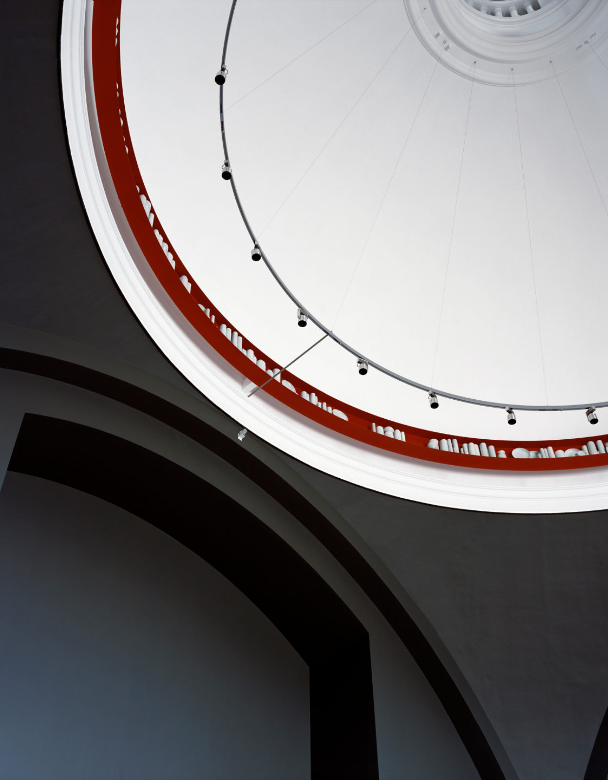
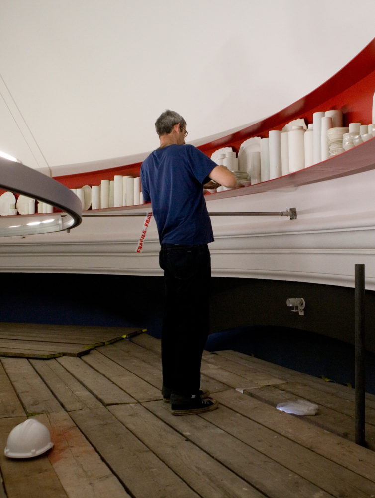
I have made an installation of pots for Gallery 141. There are 425 vessels made out of porcelain and they are placed on a red metal shelf that floats high up in the dome. You can just see it from the entrance hall through the square aperture in the coffered ceiling if you stand in one of the mosaic circles on the floor. It is called Signs & Wonders.
I also want to make this installation part of the fabric of the V&A.
Exploring the museum as a boy I kept coming across ceramics. Not just ceramic objects in cases, though they do occur in many places – figure-studies in clay, Palissy plates in Renaissance galleries – but as part of the architecture itself. The museum is embedded in ceramics.
There are the terracotta decorations for the Lecture Theatre facade, manufactured in 1865 by Blanchard & Co., great columns with intricate decoration representing the ages of man. There is the Centre Refreshment Room where there are columns designed by James Gamble and made by Minton. The Building News called these, rather wonderfully, ‘sham columns in a casing of crockery built up around a brick core’. There are exhortatory texts in majolica that run around the room as a frieze. And elsewhere in the museum are mosaic floors (some made by women convicts at Woking Prison).
And then there is the Ceramic Staircase. This climbs from the space at the end of what is now the Buddhist Sculpture Gallery, past what is now the Silver Galleries and up to the floors of offices beyond. Two flights of this staircase are entirely encased in ‘Della Robbia’ ware from Minton. They were conceived of as a sort of elevation to the heaven of the original Ceramic Galleries by way of Music, Art, Literature on the first run of stairs, and Wisdom, Truth and Science on the second. I loved this idea of an ascent to ceramics through all these arts and virtues.
In the galleries there were ceramic columns. All but two have gone. Circling one of the remaining is the name of Pousa, the Chinese potter who threw himself into a kiln in order to achieve a spectacular glaze. I’m always glad when Pousa turns up.
Now, when you are not looking at the silver, you look up and can see in small gilded cartouches the names of all the significant places that ceramics have been made. It is an encyclopedia that runs from Abruzzi through Korea and lots of English kilns to end in Xijing. It is a wonderful conceit. These are the designs that a previous director in the Edwardian period wanted painting over. The windows – showing moments in the lives of great potters and ‘incidents in the history of English pottery’ – were to be replaced with ‘obscured glass of a modern kind’ and the terracotta columns recovered ‘with fibrous plaster so as to form a simple classical shape’. The Minton tiles of the floor which ‘dazzle the eye and absorb light’ were taken out and crated up. Some elements from the columns and panels from the window were found in the stores 30 years ago.
There are ghosts and memories of ceramics in this building too.
When the invitation to make something for the gallery was first mooted I was sent huge architectural floor plans and elevations. And I picked up a red pen and did a ring around the dome. Here, went the scribble, this is where I want to work. It began with the combination of a gesture of a pen and the plans of this austere bit of Edwardian architecture. There are ceramics in the walls and floors in the V&A. Why not in a dome too?
The porcelain vessels are held on a red shelf. It is the colour of lacquer. It is the colour of the red seal in the corner of ink paintings. It always puzzled me how it was possible to have a painting of a scholar in some mountains in mist, all in penumbrous washes of grey, and have emphatic scarlet marks in the same visual plane. It is the colour of a looping scribble in red pen.
I wanted the shelf to be in metal – a proper material like a steel engineering beam rather than a bit of spray-painted MDF. Partly out of respect for the solidity of the building itself, but mostly because I think you can sense when something is sham. And I had started working with placing porcelain in lead-lined boxes and on steel shelves and was intrigued by how well the two materials worked together. These two kinds of density are a provocative combination.
And I wanted this red scribble of a shelf to float above the cornice, away from the dome, so that there was this mass of porcelain held in space.
How do you make a gesture in space? So began a huge process of consultation with the curators of the Ceramics Galleries and then with architects and surveyors. Nothing is off limits, said the curators, and so we stood and looked up from the entrance hall, through the interstice in the coffered ceiling designed by Aston Webb of teak inlaid with holly to find if you could actually see the cornice in the gallery where the porcelain would be. We made a section of a maquette and tried out its position in the dome balancing it from two scaffolding towers. We made a scale maquette of the red shelf in steel and I made a couple of hundred fiddly little pots and we hung it in the studio.
And we met with engineers. There was a first meeting in my studio which ended in a lot of shaking heads. The stresses were too great. A shelf would tip or spin or twist. The dome was too weak. The shelf was too thin. We’d end up with a pile of shards on the floor of the gallery.
This was the first time I’ve worked with engineers and I thought that this was the end, the dispatch of the dream. It was only the start, and this great puzzle was thought through and worked on and the stresses were modelled and drawings issued for consultation. We all put on hard hats and climbed up to see the outside of the dome. And ten months later we stood in a factory on the coast near Lancaster looking at the finished metal shelf. It was ready to go off to be powder-coated and it was in its raw grey state, a beautiful arc, true to 2mm across the diameter of 12 metres. A week after that we saw it being installed. A beautiful red ring held in only four places, floating in the dome.
I had a very strong sense of how I wanted to work with the collections. There are many artists working with collections to disrupt them, bringing a fierce bit of contemporary brio into play with these old artefacts. For a decade or so it has been difficult to move through museums without encountering something of this disruption. By making you conscious of what is between you and the work of art, goes the argument, you can come to the vessel or the painting or the sculpture afresh and unencumbered by all those antiquated connoisseurial decisions. And for many of these artists the old-fashioned vitrine has become a useful place to situate their work: it is a smaller framework that replicates the larger institution. This can be done with great delicacy as Richard Wentworth did, collecting the detritus from the forecourt of the British Museum and installing the squashed juice cartons alongside Etruscan beakers. Or it can be done with a heavy-handedness: look at the power of the curator, the conventionality of display, the controlling presence of the vitrine, go these interventions. Don’t look at those objects, look at me.
When I started to think through the installation, I thought that I would make a piece that responded to the whole of the ceramics collection, from Hispano-Mooresque ewers to Roman beakers. You would be able to look up and see lyrical snatches of world ceramics brought together in some kind of rhythmical progression. But I realised that if I was to do this I would end up as sort of Casaubon figure, trapped in an impossible task of mapping the vastness, attempting to bring into some kind of academic rationality what is an irrational, heterodox collection. I would be up there for many more years. And this way of working could slide into pastiche. Why would I want to sit at my wheel and make a version of a sixteenth century vernacular puzzle jug, a pot I’ve never liked?
To make it work I had to use the three parts of the collection that are part of my memory of the place, the Chinese porcelains, the eighteenth-century European porcelains, and the collections of the modern era from Vienna, Bauhaus and the Constructivists. It is only as I installed it that I realised that this circularity made complete sense for me emotionally – the way in which one kind of ceramic object from one place and time changes into another. That the shape-shifting nature of influence –how Böttger looked at Chinese beakers – is not a simple linear relationship, but part of a flow around into Modernism and back again. It is perpetual rediscovery.
I wanted to work with objects that have been part of my life for 30 years and which I love. And to make sense of my memories of how pots lived in the galleries, I bought one of these de-commissioned mahogany vitrines for research and it was moved into my studio. I thought, vaguely, that its presence would help me to work out my feelings about pots behind glass as I made the porcelain for Signs & Wonders. I can attest to its phenomenal weight as we tried to shift it periodically in order to get to the wheels.
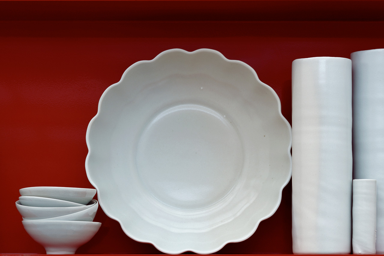
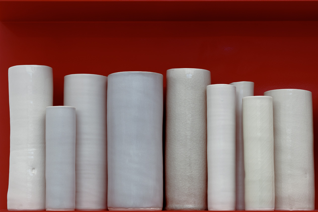
There are two ways the 425 porcelain vessels that make up Signs & Wonders have been made. The vast majority have been thrown by me in the French porcelain from Limoges that I have been using for 15 years. There is mild surprise when I explain that I have done this, as if the chance to make the vessels themselves was a sort of post hoc bit of sorting-out, rather than the imperative itself.
If I was going to make something for the V&A I wanted to do it myself. Many of the pots that I’ve made are forms that I’ve never made before.
I’d look at some part of the collection hard and then look away and then make the after-image. It was a kind of distillation. What is left of that garniture of seven Sèvres jars when you have looked away? The sense of formality and poise around the fulcrum of a central vessel, the feeling of variations of colour being carefully played out. And so I’d make a garniture, and then another different one, paring down a baroque piece of Sèvres into a few changes of angle and volume. The memory of objects means that Henry Cole’s tea-set is up there somewhere in close contact with the Bauhaus at last.
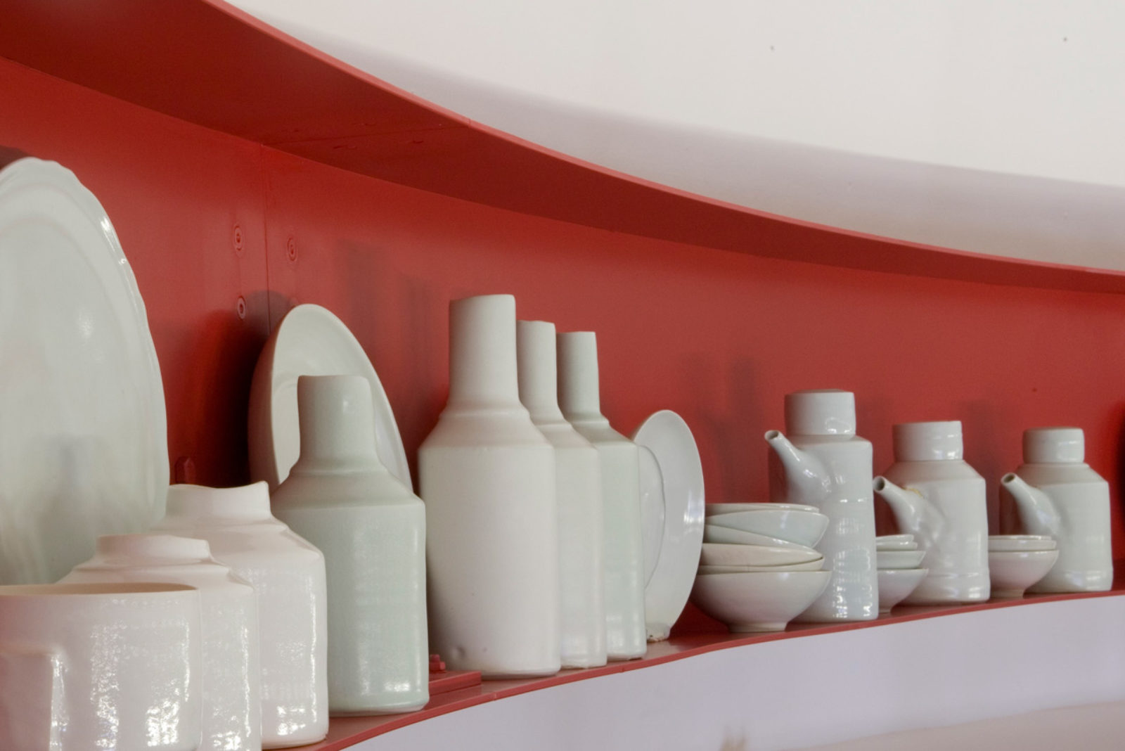
Some whole sections of the installation come from this response to particular objects in the collection. If you look up you will see haphazard stacks of small bowls, for instance, that are an after-image of the stacks of kiln wasters. And also come from a desire I’ve harboured for decades to get into the cabinets of Chinese bowls and stack them high to see how the shadows look.
Other sections, one run of bottles that are in different celadons for instance, are a memory of vessels from disparate parts of the ceramics collections brought into taxonomic focus. And there are parts of Signs & Wonders where I have explored how objects are stacked or displayed in series. There are a dozen coffee cans and saucers up there, and part of a dinner-service and a whole episode of bowls on stands that I made from a recollection of seeing a Sung Dynasty bowl held up high on its stand. This is the use of memory and the after-image as the intense holding of a form on the retina.
Much of the installation uses memory in a different way to produce the blurred after-image. I’ve done this once before with a piece, Ghost, in Kettle’s Yard where I had replaced a line of plates and vessels. But this is the first time I’ve worked in this way at any scale. And in thinking through how to make it work I found myself drawn to the photographer Hiroshi Sugimoto and the painter. Gerhardt Richter. Sugimoto makes large-scale works that have explored diverse themes from seascapes to Buddhist sculpture. His 1993 exhibition in Chicago, Sugimoto: Architecture, a series of blurred photographs of Modernist architecture was revelatory for me. I’d stand in front of his picture of Mies van der Rohe’s German pavilion from Barcelona or Schindler’s house from Los Angeles, and try and understand why they had such presence. It was not just that their seemingly random, haphazardly taken quality brought you back to a particular moment standing in front of a particular building. It was that they seemed to be simultaneously images of a memory of place.
Gerhard Richter’s paintings of photographs have this strangeness, where the layering of the idea of images are a sort of palimpsest, those early manuscripts where one text has been written over another, so that the two are simultaneously present. But where Sugimoto’s blurring makes it possible to see the lineaments of an iconic building as if for the first time, Richter’s blurring makes a throw-away cutting from a newspaper or a holiday photograph into a new kind of image. He makes it unstable. My installation is a series of blurred after-images of both iconic objects and throw-away ones.
There are also dishes and plates as part of the installation. Some are thrown by me but some would never have been thrown in the first place and it would have been obtuse to try. So different forms – a Chinese celadon dish from the early Ming Dynasty, a dinner plate from a Japanese Imari porcelain service, a scalloped eighteenth-century dinner plate and a blue and white meat dish made in Staffordshire at the turn of the nineteenth century – have been made in a different way. They were copied and made into moulds and the moulds were used to make the dishes at the Stoke-on-Trent factory of the Leeds Pottery, Hartley Greens & Co.: pleasingly this is a firm who has eighteenth-century work in the V&A collection. So these dishes are in some way ghosts of originals. They too have the feeling of an after-image.
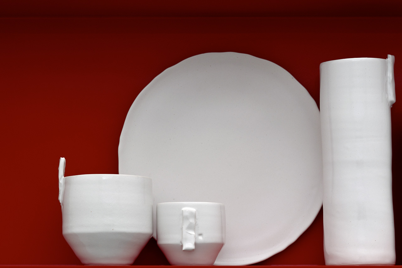
Each of the pots has a back stamp on them too. A red circle enclosing the logo of the V&A and ‘Signs & Wonders’ and my name. They are authenticated in a way that an Edwardian collector or curator might understand: they all belong together.
All these vessels, the hundreds of bowls and ewers and dishes, have been glazed and fired in my studio in South London. We have been building a library of whites and creams and greys and celadons up for many years. This group uses the whole spectrum for the first time. These are all colours that have particular resonances. Some are obvious like the soft blue-greys that are reminiscent of Korean pots. But by using combinations of colours it is possible to build up the layerings, evoke the memories of seeing the shadowy tones of porcelain through a vitrine. It is also possible to use groupings in vivid ways. Placing a couple of matt grey cylinders against a fiercely white dish creates the intense graphic spark of a piece of Constructivist porcelain of the 1920s. Or a graduated run of whites into greys is a memory, for me, of the archive photographs of Bauhaus ceramics with their regimented attempt at teaching pottery by breaking forms down to component parts.
And all those whites. Well, white is one of the strangest colours. Not a colour for those who are scared of colour – chromophobes, to use the title of David Batchelor’s study on purity – but a colour for those who respect it. The V&A’s ceramics collection, for me, has the greatest spectrum of whites in the world. Signs & Wonders brings these whites out of vitrines.
I know that it seems perverse to take them out from behind glass and then put them so high up. It is, at one level, simply a way of putting things out of harms way. On a high shelf things don’t get knocked. Though this also has its risks, as Emily Dickinson wrote in a poem in 1863:
It dropped so low — in my Regard
I heard it hit the Ground —
And go to pieces on the Stones
At bottom of my Mind —
Yet blamed the Fate that flung it — less
Than I denounced Myself,
For entertaining Plated Wares
Upon my Silver Shelf —
There is a sort of hubris in how high you put your wares on your Silver Shelf. But they can drop in your regard: this installation is also, simultaneously, a way of putting away all those things that you do not wish to see. The attic (or the box-room or the muniments room) is the place where objects won’t bother you by their presence.
I have made an attic before. It started at the Geffrye Museum as part of an installation, and then was re-installed at an exhibition at Kettle’s Yard in Cambridge and has ended up in a London house. And in all three incarnations I’ve loved the sense of not seeing everything that these high-up, tucked away groupings have given. By having them so high up they become blurred.
Why is it so rich not to have everything anatomised in front of you, labelled and explicated? Rather than the object stranded on the plinth attempting to flag you down, if you place it elsewhere there is that feeling of possibility and latent discovery, similar to the feeling that you get if you are lucky enough to see the stores in a museum.
The installation connects the threshold of the museum to the Ceramics Galleries only if you look up or down. And I’ve become more and more interested in the ‘if’ aspect of making things. This is not a question of being circumspect or modest. It is after all a 37-metre aluminium ring powder-coated a beautiful lacquer scarlet with hundreds of porcelain vessels on it.
If you look up it is there. If you do not look up it is still there. Signs & Wonders is not an attic space, nor yet a store-room, but it is another collection. Another to add to this collection of all collections.